
Packaging design, branding, environmental design, marketing
-
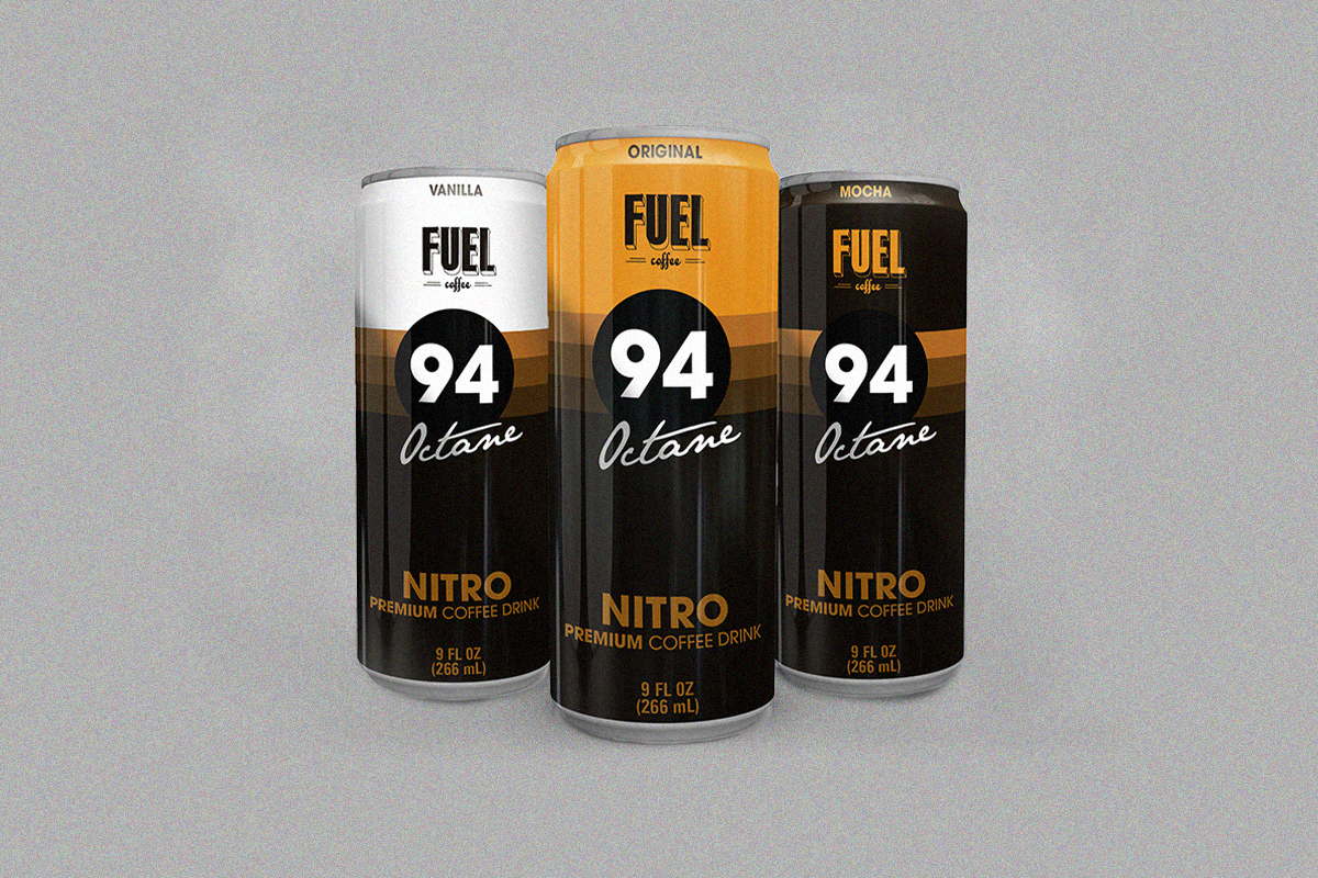
For this school project, I was tasked with creating a sub-brand of ready-to-drink (RTD) coffee cans for the established brand, Fuel Coffee. The objective was to help Fuel expand into a new market and attract a broader customer base. Since 2005, Fuel has been known for its high-quality, no-frills coffee, with branding inspired by vintage 1960s gas stations. I sought to carry this theme forward in the sub-brand, which I named 94 Octane.
-
I was tasked with developing a sub-brand for Fuel Coffee that maintained a strong connection to the parent brand while standing out from its existing product lines. My goal was to create a brand identity and can design that would be eye-catching on store shelves. The primary vending locations for these RTD cans would be gas stations and grocery stores.
-
I drew inspiration from the vintage race car aesthetics of the 1950s and 60s, aiming to evoke a sense of speed that mirrors the energizing effect of coffee. My goal was to maintain the metaphorical connection between gasoline and coffee that Fuel Coffee established in its original branding. I explored multiple design iterations to find the most effective solution that fit the shape of the can, all while ensuring compliance with FDA labeling guidelines.
-
I started by researching vintage gas station aesthetics, noting their signage with bold typography, circular layouts, and color palettes. From there, I developed a visual language that balanced retro authenticity with modern clarity. The final design bridges past and present, reestablishing Fuel Coffee as an energizing, unpretentious brand with roots in hard-working Americana.