Logo design, Packaging Design, Billboard Design
-
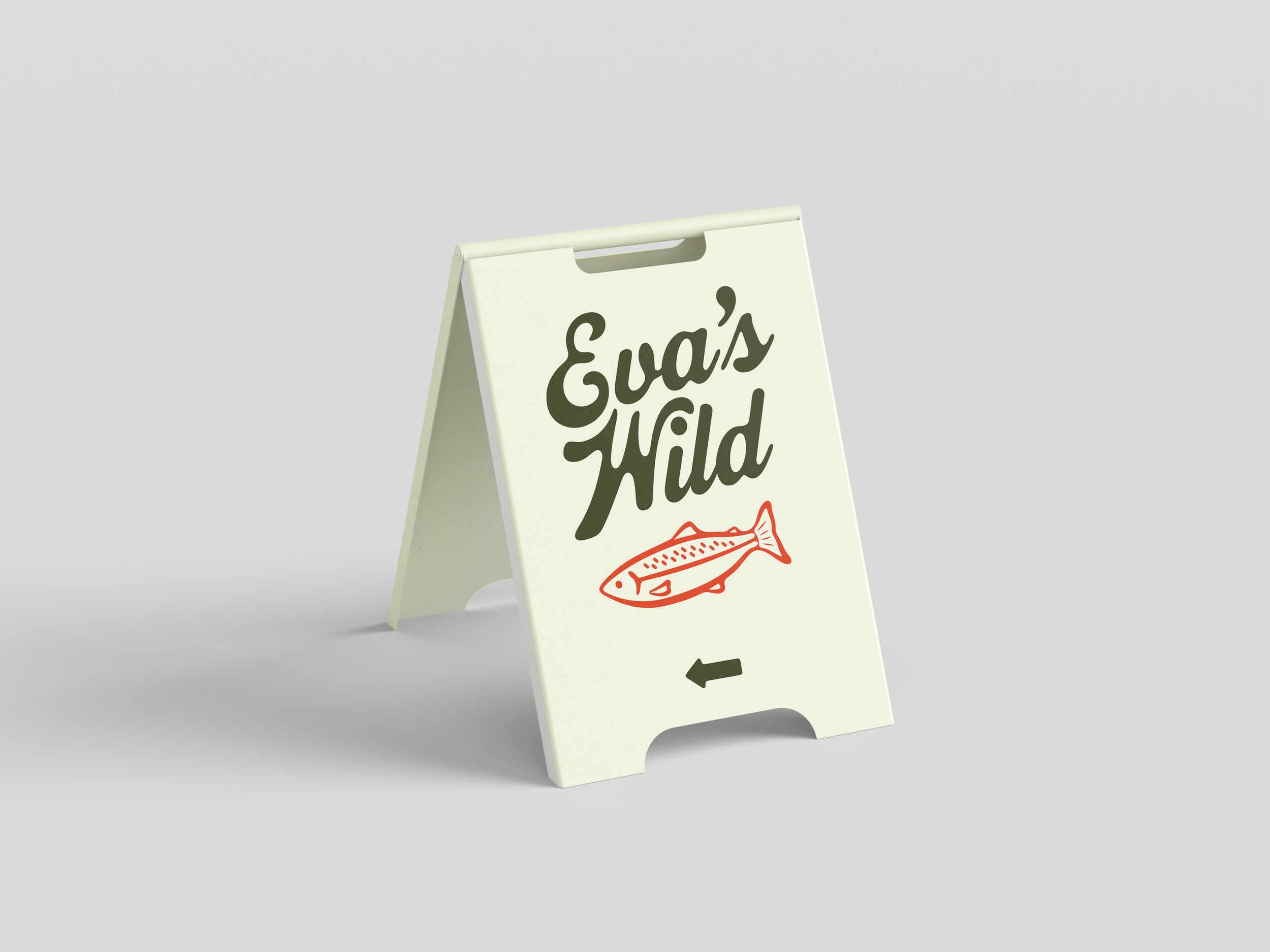
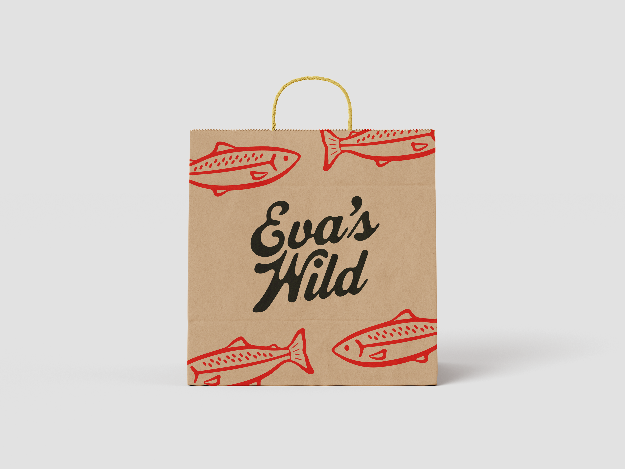
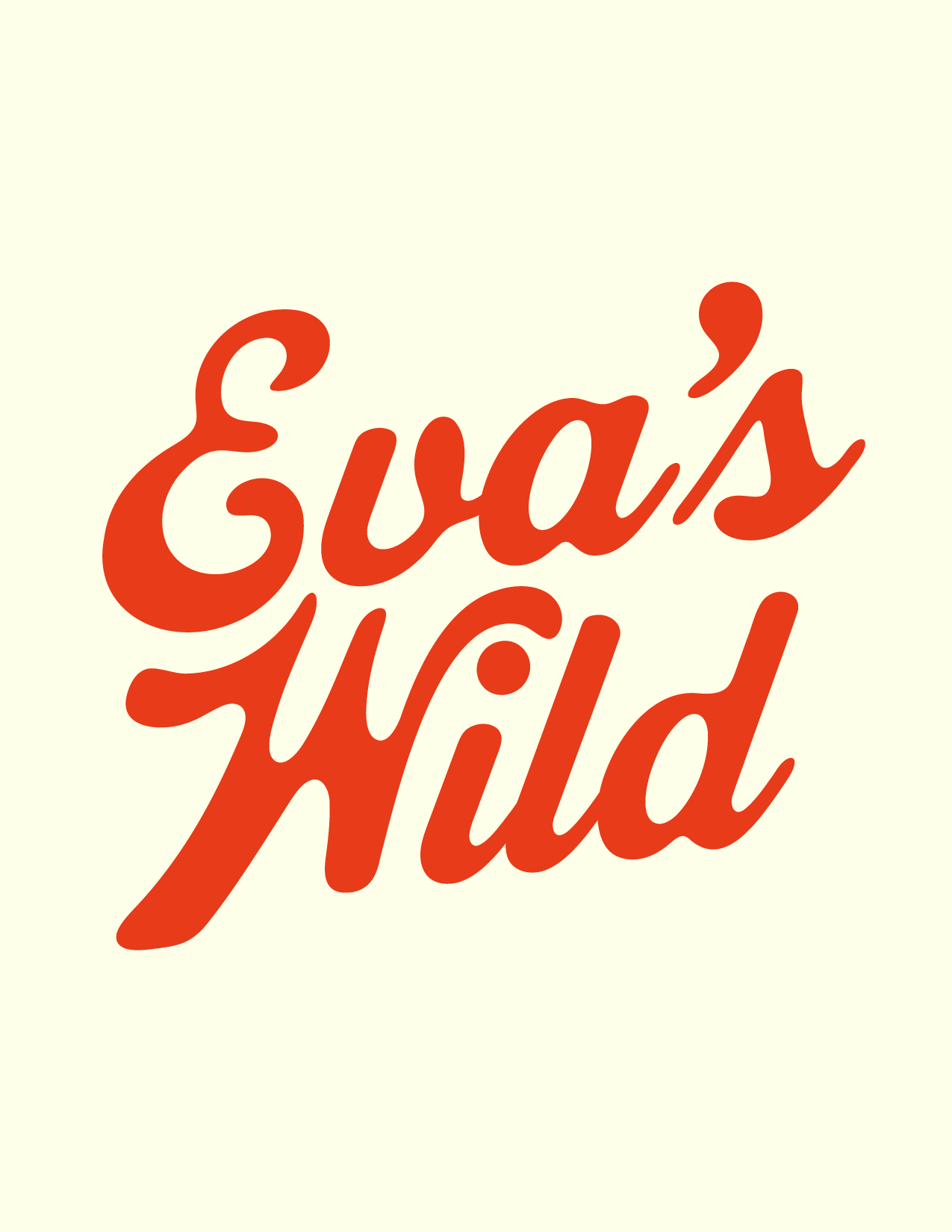
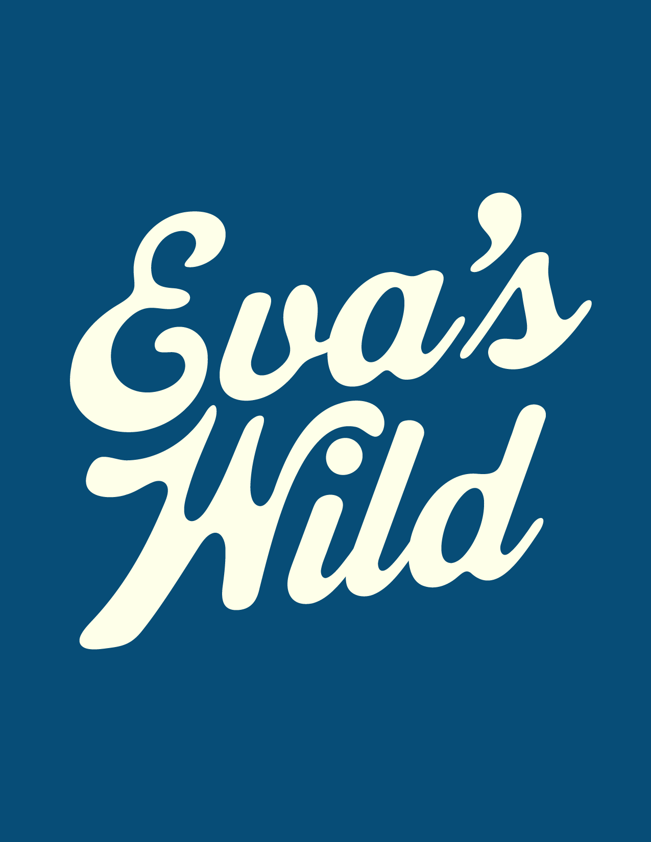
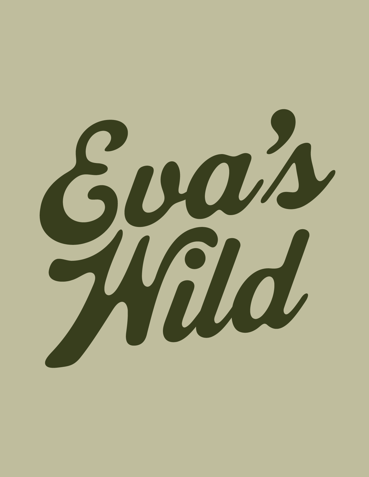
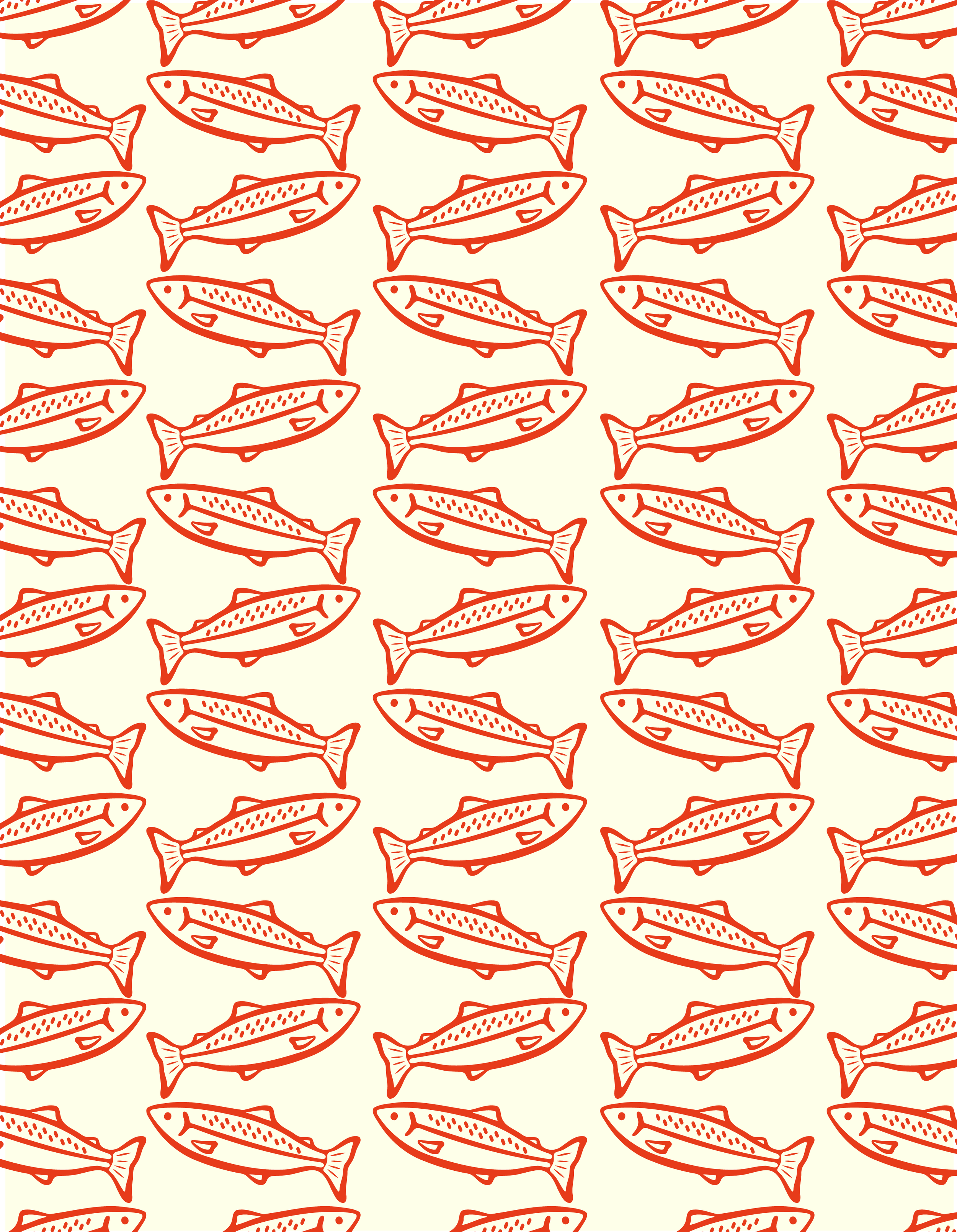
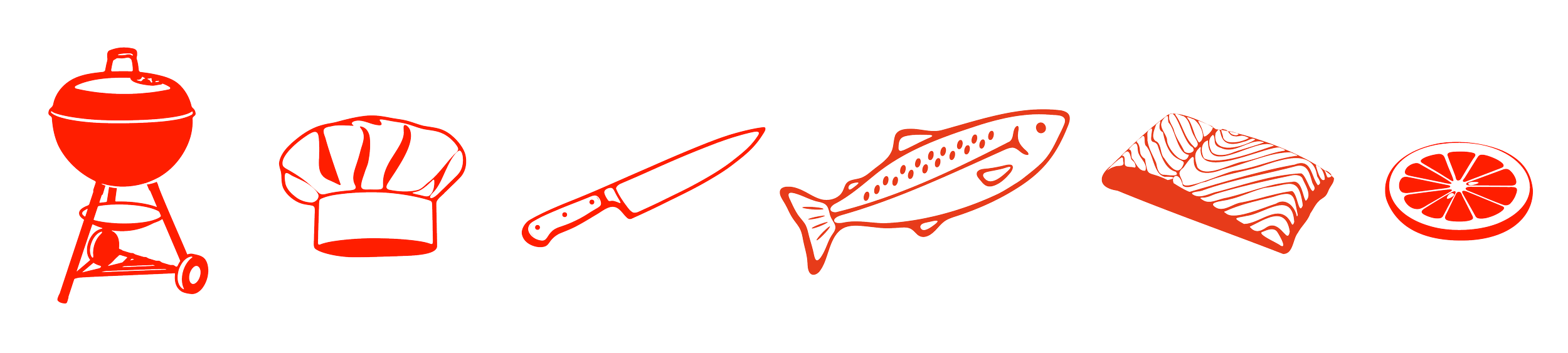
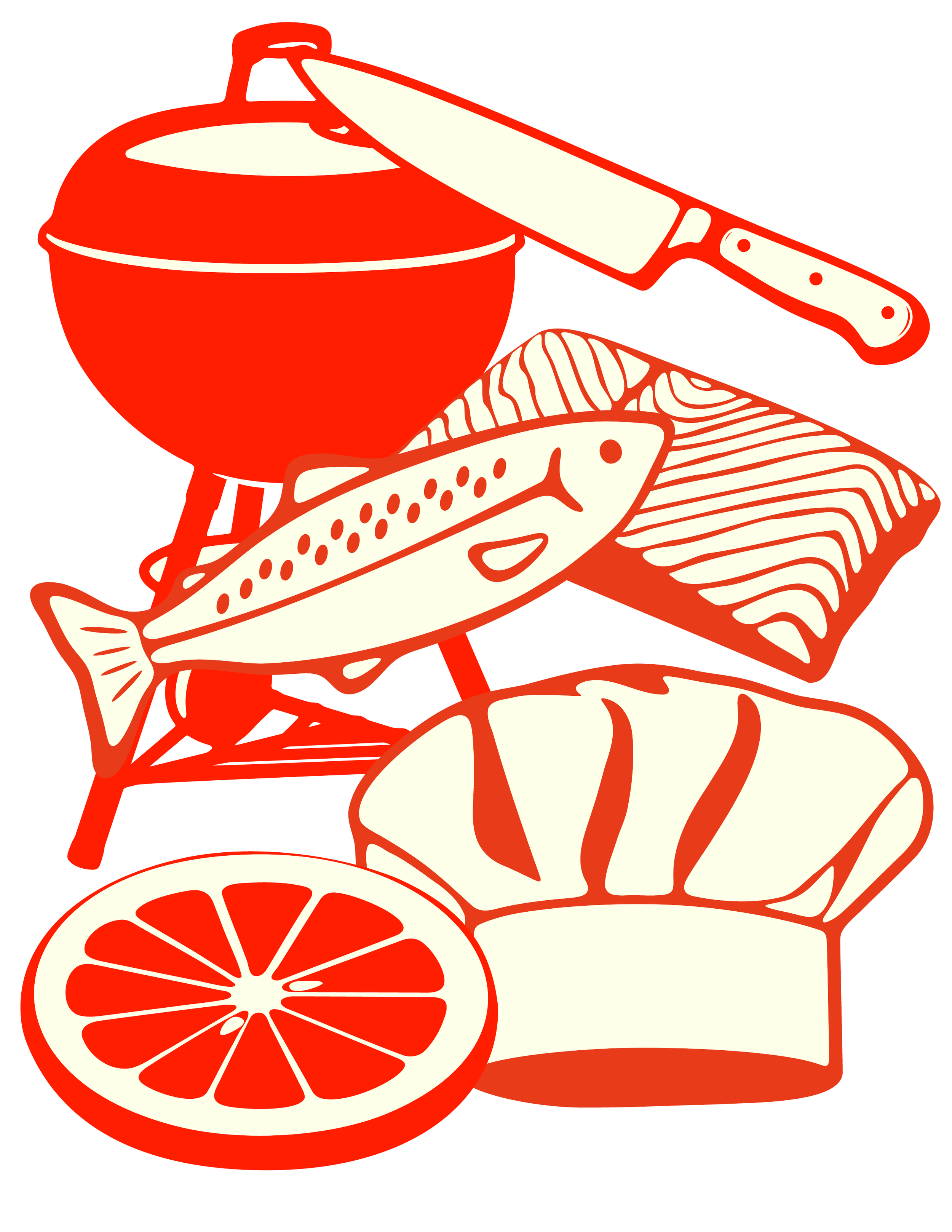
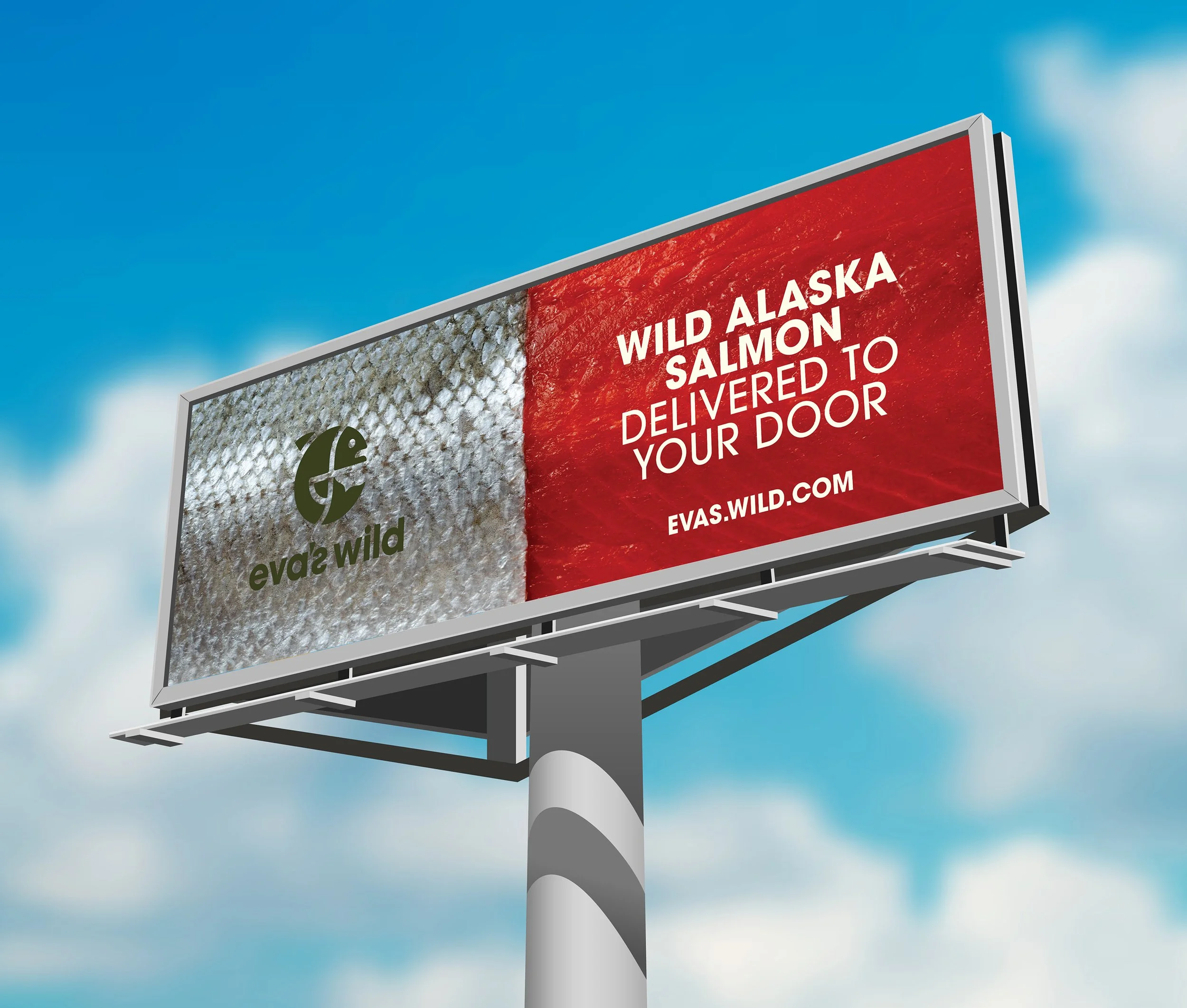
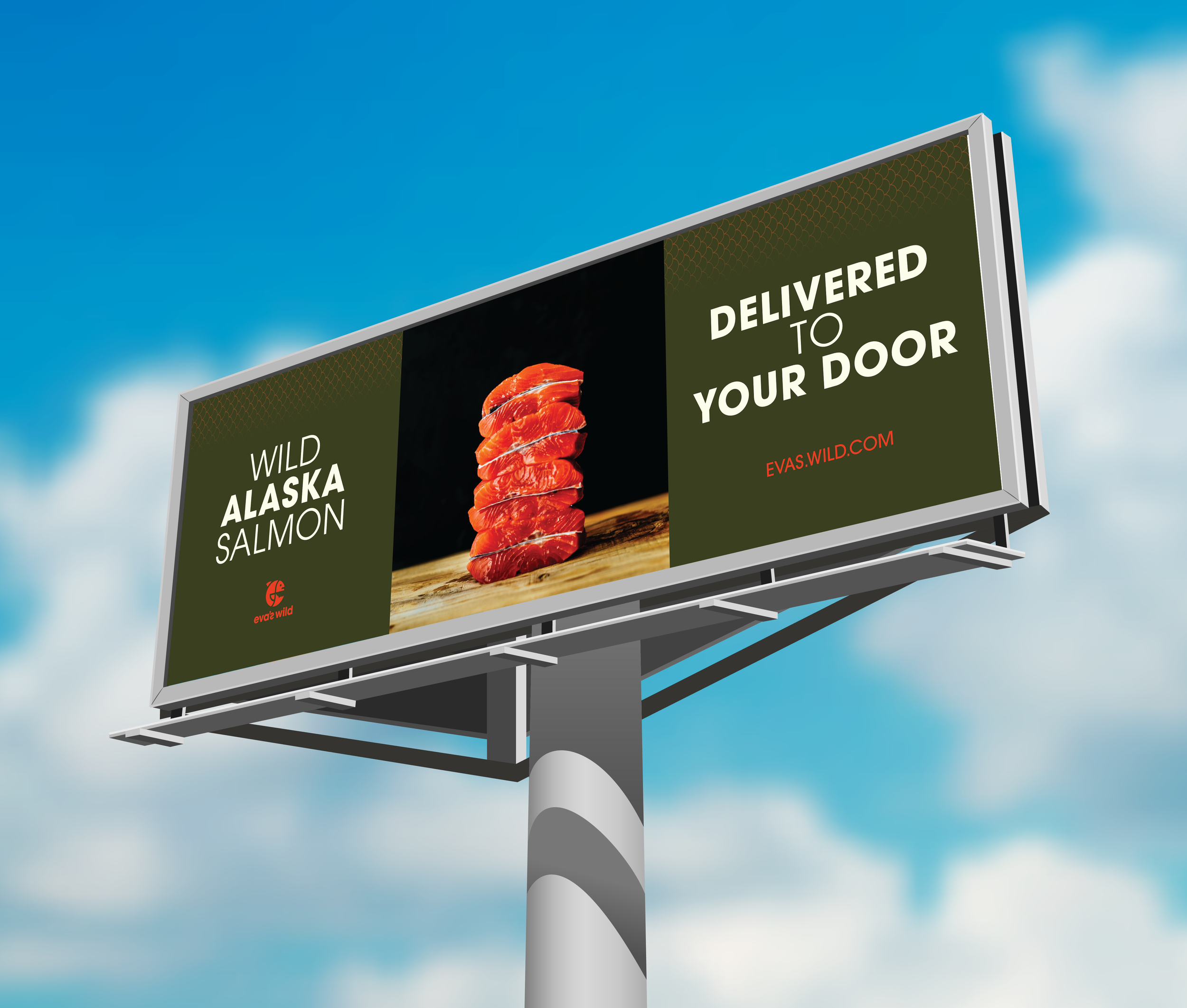
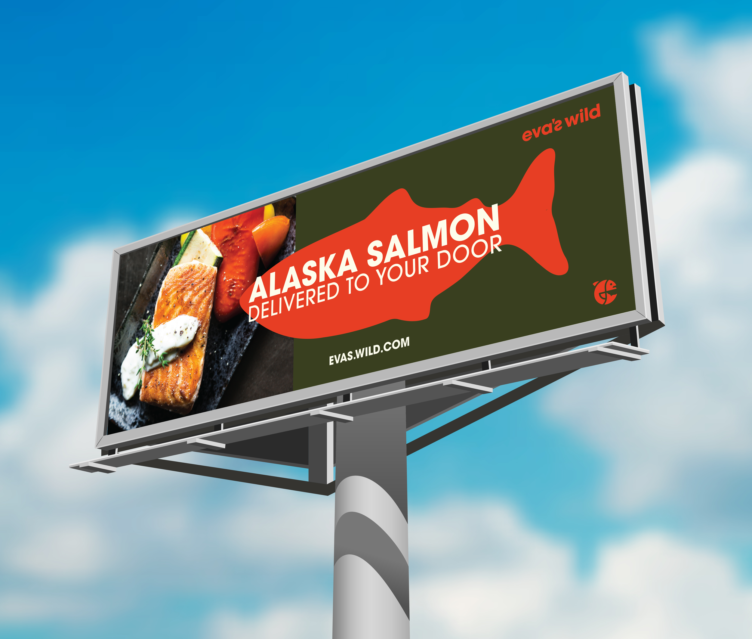
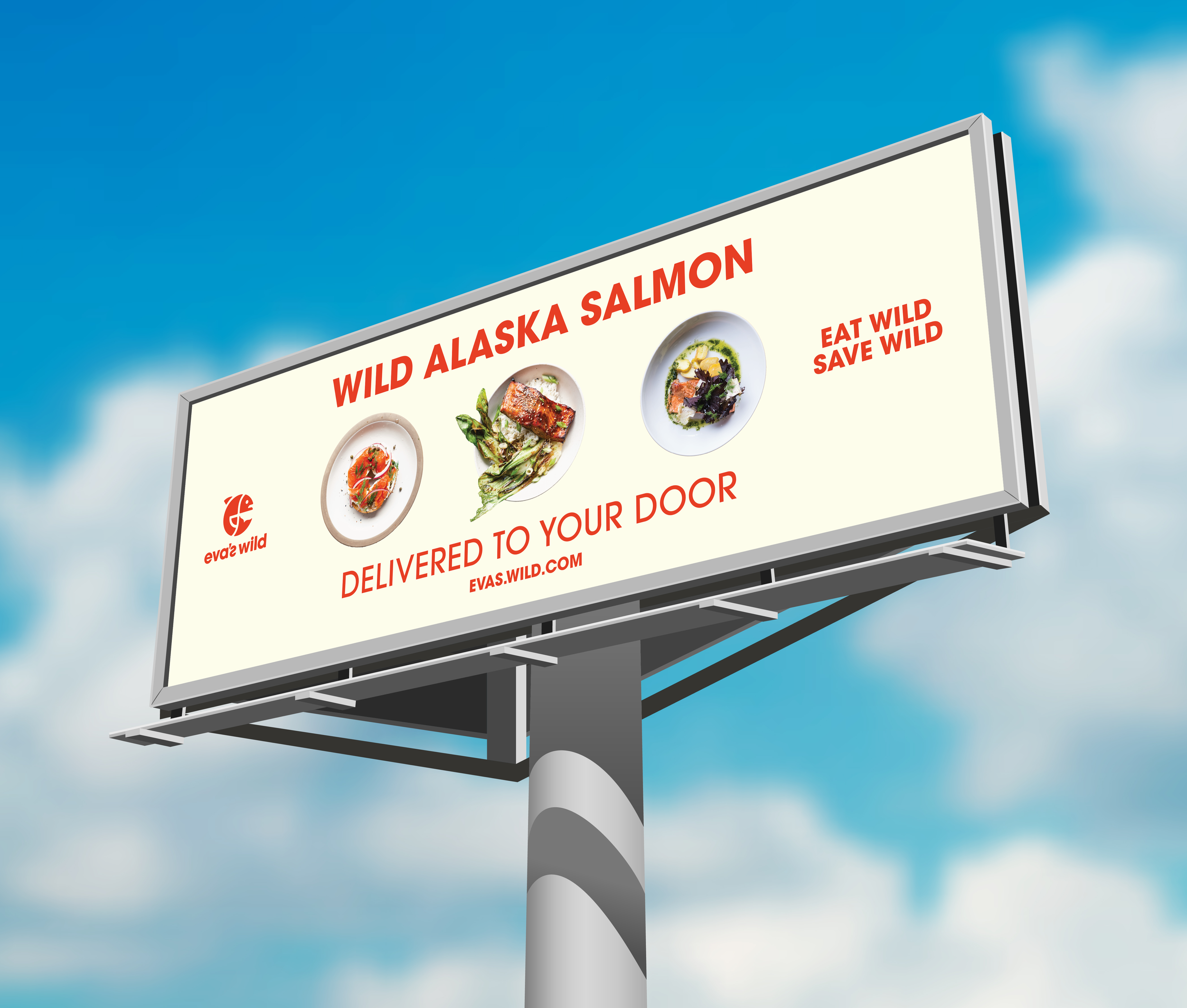
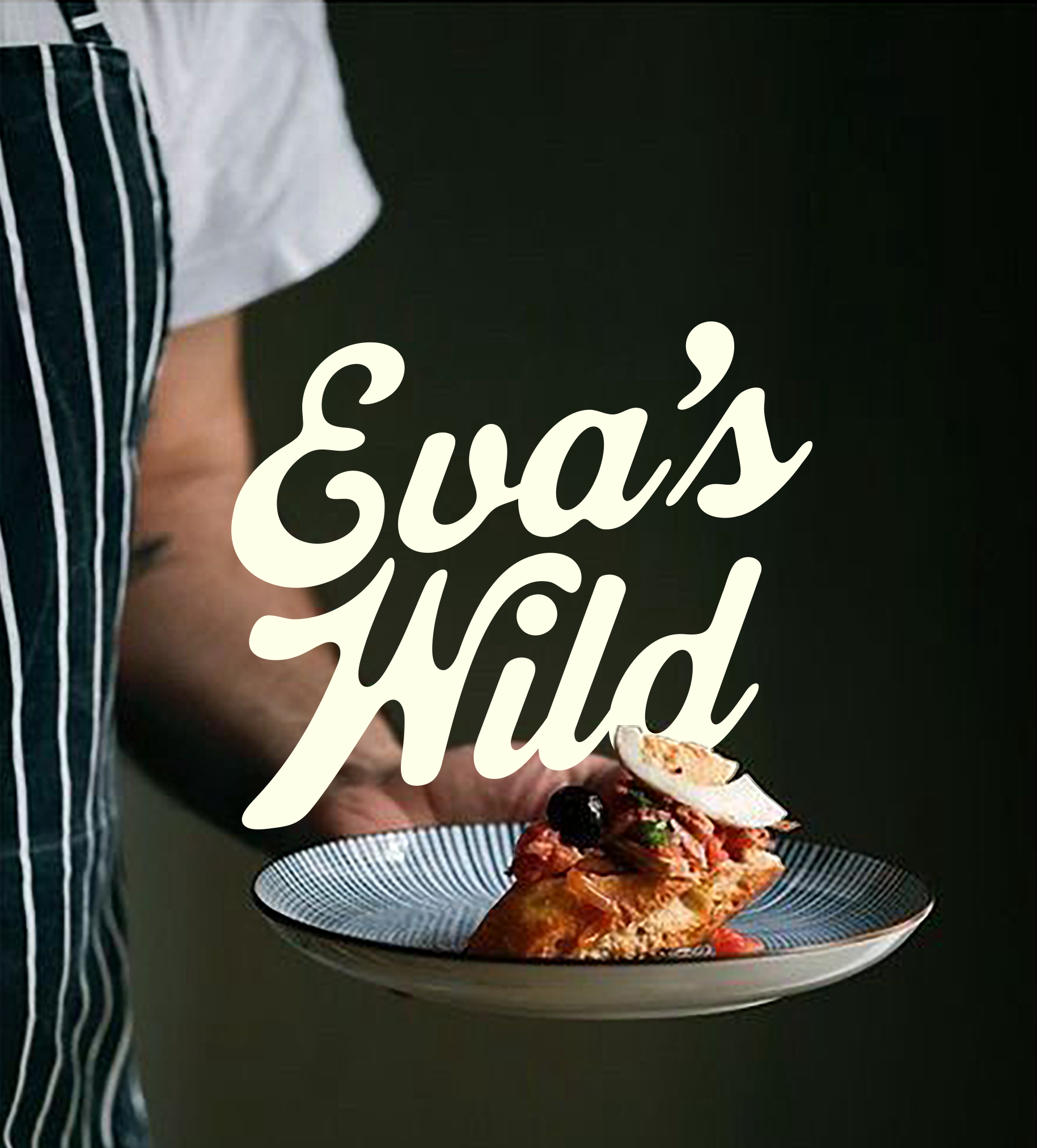
Eva’s Wild, a sustainable Alaskan salmon distributor, sought to expand into the hot food market. I developed a sub-brand with a fun, approachable, and eye-catching identity. The design featured bold typography, playful illustrations, and a fresh color palette. The result was a cohesive, appetizing visual system that connected seamlessly to Eva’s Wild’s core brand while standing out in urban food spaces.
-
I needed to create a sub-brand for that felt seperate but connected to the parent brand. I needed to make it feel for like a hot food brand to attract new customers to their new food truck. Primarily a sustainable salmon distributer with clients in the fine dining industry, I was tasked with making the sub-brand feel more approachable and appetizing.
-
Through bold, and classic typography, I made the new sub-brand feel more playful, approachable, and hunger enducing. I created a branding package that included original illustrations, a new color palette, and billboard examples to help guide the new brand moving forward.